
Post by Tracy Kaler.
Pink and blue aren’t exactly cutting edge, but Pantone is the go-to source when forecasting color trends for the upcoming year. According to the color management gurus, blending “Rose Quartz” and “Serenity” is bound to create loads of chatter over the next 12 months.
Since we’ll be seeing a lot of baby pink and blue throughout 2016, let’s get a head start and preview some delicious rooms using these two proper and poised pastel colors. Spoiler alert: Yumminess lies ahead.
Besides the blue in the throw pillow, this gorgeous bedroom by Jennifer Ott keeps things pink. Barely rosy, the walls and floor add a sophisticated quality to this room without being too feminine. Plus, the upholstered chair, lampshades, and accent pillows contribute the perfect amount of pattern.
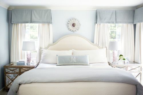
Calming and tranquil in every way, this space uses baby blue with white and introduces a touch of pale pink in the bedside lamps. Somehow, it’s the perfect amount.
Soft blue paisley wall covering acts as a lovely backdrop for this London bedroom. Notice the vase of soft pink roses on the nightstand, as well as a dash of pink in the artwork.
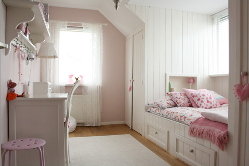
This chic family home in the Netherlands uses pale pink in a whimsical little girl’s room. The designer brought other rosy tones and white into the space, keeping the overall feel light and airy. Built-in storage keeps clutter at bay. This bright, cheery space could transition into an adult guest room with a few easy tweaks.
How do you feel about Pantone’s “Rose Quartz” and “Serenity”?


How I feel about pink and baby blue is not good. I really dislike those colors. Well, we’ll see what next year brings.