
Tag Archives: Color
Bedroom Design: Get Inspired by Color-Filled Bedrooms
Post by Tracy Kaler.
When it comes to decor, sticking with neutrals might seem like the safest choice, but we’ve all seen those beige rooms that are completely lifeless. In other words, it’s possible to ruin the interior design even if you opt for white or tan. Sure, painting a wall red or cobalt blue requires a fair amount of gumption (and trial and error), but you’ll rarely label a bright room bland or boring. Let’s get inspired to decorate with color as we admire these five color-filled bedrooms.
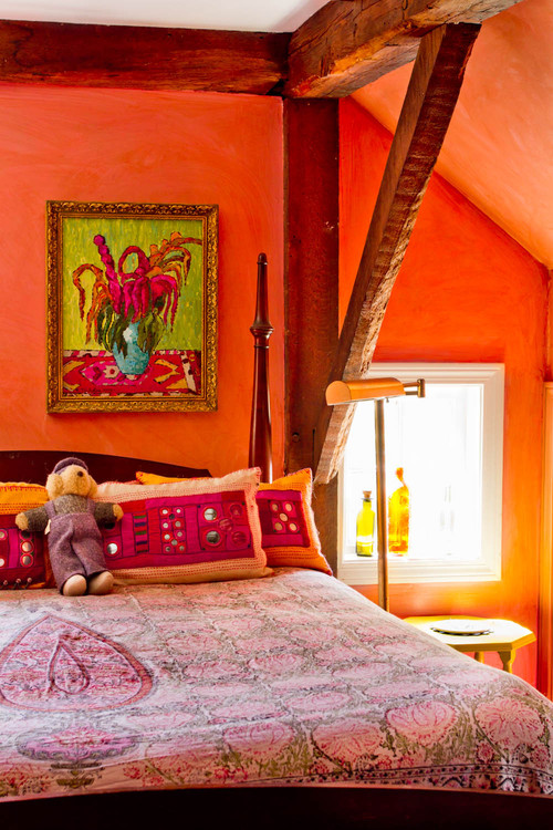
This New York farmhouse bedroom appears to get great light, so this bold wall color stays clear and doesn’t turn muddy. It might be the perfect shade of Chinese red.
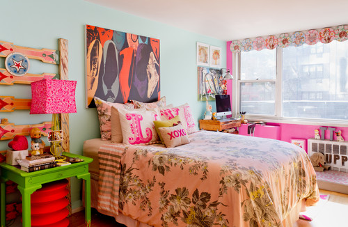
Owner Jeanie Engelbach certainly doesn’t fear color! This New York City bedroom has a youthful, whimsical feel. She goes out on a limb introducing neon, combining it with classic bold tones and a muted robin’s egg blue on the bed wall. Somehow, it all fits.
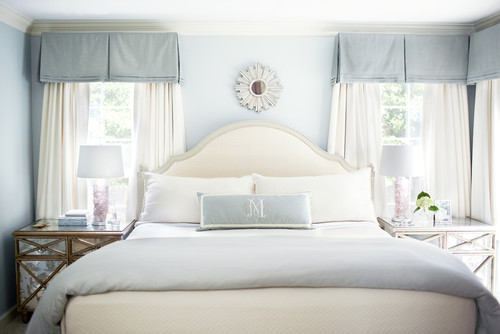
No, that’s not paint on the walls. That lush finish is silk wall covering. Although this bedroom isn’t bold, the color palette of varying blues isn’t easy to pull off. From glancing at this vignette, we can tell that this room is luxurious.
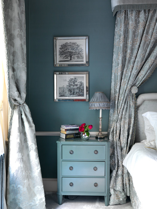
Photo by Adam Butler Photography
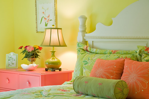
If you love spring, you’ll love the bedroom pictured below. Spring green, lemon yellow, and bold orange come together to create one of the happiest bedrooms I’ve ever laid eyes on.
This little girl’s room pulls out all the stops for sweetness. Different shades of lavender and fun artwork set the stage. Notice the lime green desk chair. It’s unexpected, but becomes the ideal accessory.

This Philly bedroom feels beachy, but it’s several hours from the coast. The throw on the bed picks up the black and white striped flooring perfectly.
Bedroom Design: 2016 Colors – Pantone’s ‘Rose Quartz’ and ‘Serenity’
Post by Tracy Kaler.
Pink and blue aren’t exactly cutting edge, but Pantone is the go-to source when forecasting color trends for the upcoming year. According to the color management gurus, blending “Rose Quartz” and “Serenity” is bound to create loads of chatter over the next 12 months.
Since we’ll be seeing a lot of baby pink and blue throughout 2016, let’s get a head start and preview some delicious rooms using these two proper and poised pastel colors. Spoiler alert: Yumminess lies ahead.
Besides the blue in the throw pillow, this gorgeous bedroom by Jennifer Ott keeps things pink. Barely rosy, the walls and floor add a sophisticated quality to this room without being too feminine. Plus, the upholstered chair, lampshades, and accent pillows contribute the perfect amount of pattern.
Calming and tranquil in every way, this space uses baby blue with white and introduces a touch of pale pink in the bedside lamps. Somehow, it’s the perfect amount.
Soft blue paisley wall covering acts as a lovely backdrop for this London bedroom. Notice the vase of soft pink roses on the nightstand, as well as a dash of pink in the artwork.
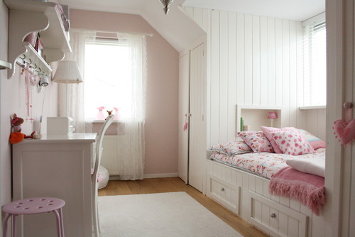
This chic family home in the Netherlands uses pale pink in a whimsical little girl’s room. The designer brought other rosy tones and white into the space, keeping the overall feel light and airy. Built-in storage keeps clutter at bay. This bright, cheery space could transition into an adult guest room with a few easy tweaks.
How do you feel about Pantone’s “Rose Quartz” and “Serenity”?
Things We Like: Subtle Contrast in Color

Post by Kyle St. Romain.
As part of my home improvement project , or un-improvement project depending on how you look at it, I am now painting the walls in my entryway, kitchen, and main living spaces. When I first painted them nearly 8 years ago, I chose a very sterile white. While I spent a considerable amount of time selecting that particular shade of white, it never really did much for me. The good thing about having white walls, however, is that they are very easy to paint over.
This go-round, I wanted to give the walls some of that personality they were lacking in white. After a few trips to the home improvement stores and much deliberation, I settled on Benjamin Moore’s Wickham Gray. An interesting bonus is that Wickham Gray is part of the Historic Color collection, which is inspired by documented colors found in 18th and 19th century architecture. A cool, modern color with some history behind it is a no-brainer for me.

What I like most about this color, and what inspired me for this post, is the subtlety of it. In certain light and at certain angles, you can hardly distinguish it from the white it’s being painted over. However, when you see it next to the Winter White baseboards and trim, it has a nice little pop. At other angles its appearance ranges from a steel gray to an almost velvety light blue. Generally hard to impress, I am floored by the depth and intrigue of this color.
So when you are deciding on new color palettes for your bedroom or other areas of your home, think about ways to create subtle contrast; contrast doesn’t always have to be big and bold. An accent wall, white trim, exposed walls and duct work, or incorporating other design and architectural elements can really help what you might otherwise think to be an uninteresting color stand out. As is the case with this Wickham Gray, in certain light, you may hardly even notice the color at all. But as the light changes, you and your guests will be in constant amazement over how the appearance of your room changes with it. A little time spent planning these subtle contrasts can help bring you enjoyment from your room for years to come.

Bedroom Design: Shades of Gray
Post by Erin Sears.
Glorious Gray
Living in Portland, Oregon, I’m accustomed to gray. We’re old friends. I’ve accepted that soon the blue skies of summer will be replaced by the cozy gray dome that we live under for most of the year. You’d think I’d be sick of gray, but gray happens to be one of the hottest colors in home décor right now and I love it! Painting a bedroom gray is a great way to provide your room with a grounding neutral color to which you can add luscious pops of color. Yellows, purples, turquoise and hot pink all look stunning against a gray base. Conversely, adding gray accessories in a room adds an element of sophistication. It shows that you know what you’re doing. In the September 2012 issue of House Beautiful readers listed gray as one of their favorite color choices. Let’s take a closer look:

Source: House Beautiful
Gray tufted bed with hot pink accent pillow and monogrammed shams. So elegant!

Source: http://www.atelierabigailahern.com/
The red bed and yellow pillow really stand out against the washed gray wall. It’s rustic and cozy.

Source: www.houzz.com Jessica Lagrange Interiors

Source: http://www.charlesprogers.com/european-linen-duvet-shams-p-162.html?cPath=3_15
If you aren’t able to commit to painting your room or you are still saving up for that special bed purchase, how about choosing gray bed linens? Try the European linen duvet and shams from Charles P. Rogers. Nothing brings a room together faster than good bedding. Enjoy!
Bedroom Design: Best Bedroom Colors

Post by Kyle St. Romain
Choosing the best bedroom colors can be a difficult task, especially if it’s the first time you get to choose the color of your bedroom. Most apartments and rental homes leave the bedroom walls white, and for very good reason: white goes with everything. However, white can be boring, especially the drab white landlords use. If you’re ready to add some color to your bedroom, I’ve compiled a list of the three best bedroom colors and why.
1. Neutrals
Many people hear neutral colors and think, “boring,” but this doesn’t have to be the case. Neutral colors create an ideal backdrop to frame the rest of your bedroom design against, and are more forgiving for novice designers. They also work well with different designs, which allows you to easily update the décor of your bedroom without having to repaint. Included in the broad category of neutrals is everything from white to gray, which is actually a lot. Take a trip to your local home improvement or paint store and see for yourself: you’ll be surprised how many different shades of white you can choose from.

2. Earth Tones
Earth tones include the more muted shades of brown and green. Remember, you want to feel relaxed when you enter your bedroom and lime green probably isn’t the best way to conjure that feeling. Earth tones make it easy to envision what colors to incorporate in your overall design too; simply think of what colors you’d find in a forest. Bright red is an excellent color to use for your statement piece with an earthy palette, just doesn’t overdo it.
3. Blues
The number of shades of blue you can choose from can be overwhelming. To help narrow your choices, first decide between light and dark blue. Dark blue will create a deep, mature feeling in the bedroom, while light blues are generally considered more light and airy. Use white to accent your blue walls. White floorboards, headboards, and furniture contrast nicely with any shade of blue.
What do you think is the best bedroom color? Let us know in the comments below.

