Tag Archives: Charles P. Rogers
Things We Like: Floor-To-Ceiling Tiled Bedrooms
Post by Kyle St. Romain.
A couple weeks ago my girlfriend was telling me about Italy’s Amalfi Coast, and how we should visit. Okay, I thought, you’re Italian and these sorts of daydream conversations are commonplace with us. As such, my ADD quickly took hold (Did a bird just fly by?), and I soon forgot all about it. However, this weekend, Facebook made me aware that my favorite neighbor from undergrad had just eloped on the Amalfi Coast; the universe was telling me it was time I learned more.
Once I had the location figured out (the Amalfi Coast is a lot more southern that I had thought), I went straight to the real estate pages to see how the locals live. To say the least, the results were impressive.
At the top of the list is a private island just off the coast. With 7 bedrooms and 10 baths, this magnificent €250 million estate offers lots in the way of of design inspiration; even if I’ll never be able to afford such opulence. My favorite room is one of the bedrooms. It’s covered floor-to-ceiling in intricate Italian tile, and I’ve never seen anything like it before. Words cannot begin describe it, so I’ll let the picture do the talking.
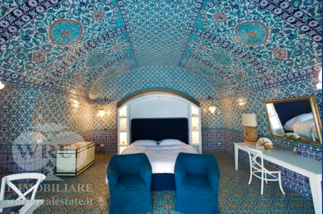
Now, I can understand that some people may not appreciate this look; it can look a bit like a steam room. Nonetheless, it makes a statement. You can see the full listing at worldrealestate.it for more photos of this modern marvel. All of the rooms are truly amazing.
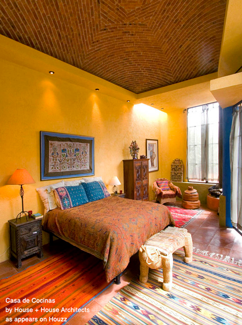
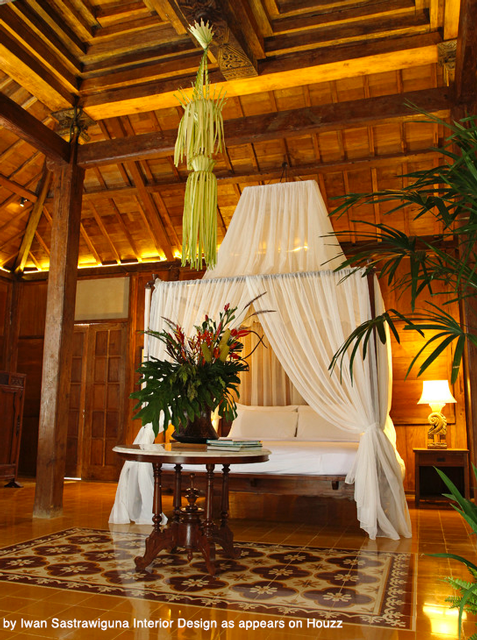
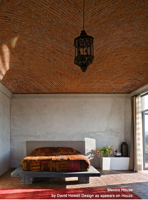
With fresh inspiration, I did some searching to find if other people had created a similar look in their homes. Unfortunately, I have not been able to find an example of a similar bedroom. The closest looks I could find use brick in a style that’s more Mexican than Italian, and there are also some interesting bedrooms with rather ornate wood ceilings. Below are some of the highlights from my search. Hopefully it gives you a new perspective on interior design, and how the ceiling can dramatically change the look and feel of a room. Enjoy.
Breakfast in Bed: Independence Day Aebelskiver (Danish Filled Pancakes)

Post by Alison Hein.
One of my favorite pastimes is browsing the discount shops. I’m not looking for splashy, red-heeled Christian Louboutins, or even a chic Balenciaga bag. Rather, I’m searching for the new and unexpected. The inspirational and one-of-a-kind. Like pepper-shaped grill racks, old-timey cast iron cornbread pans, and even Pacman oven mitts! Imagine my delight when I recently stumbled upon the perfect aebelskiver pan, at a fraction of the retail cost.
Aebelskiver means “apple slices” in Danish. With our usual laissez faire regarding foreign languages, Americans apply this term to all little spherical pancakes, whether filled with sweet and creamy apple middles or not.

Back to the pan. Usually made from cast iron, the heavy pan contains seven small, rounded wells. The pan is heated, batter poured, and the aebelskiver are carefully flipped. Instructions suggest using two skewers, but I asked my Danish friend Helen for the real low-down: “Some use apple pieces, which are added after they are baked a little time on the first side, and a lot like them with prunes .. and I use knitting needles to turn them ;-)which I learned from my mom … we normally eat them at Christmastime, with a little sugar or marmalade alongside.”
My Chinese-American friend Yane weighed in saying she uses chopsticks to flip her aebelskiver. Eureka! We’re a cultural melting pot that allows us to prepare Danish cuisine with Asian cooking utensils, and then serve it up for America’s big birthday breakfast in bed.
Happy Fourth of July!

Ingredients
1 cup unbleached flour
½ teaspoon baking powder
½ teaspoon salt
1 cup milk
1 tablespoon cider vinegar
2 eggs, separated
Cooking spray (or melted butter)
8 ounces (1/2 cup) strawberry jam
Confectioner’s sugar
1 cup mixed berries (strawberries, blueberries and raspberries)
Special Equipment
Aebelskiver pan

Preparation
Combine flour, baking powder and salt in large bowl. In separate small bowl, mix together milk, cider vinegar and egg yolks. Beat egg whites until stiff peaks form and fold into batter.
Place aebelskiver pan on burner over medium heat. Spray each well of the pan liberally with cooking spray (or brush with melted butter). Spoon about 1½ teaspoons of batter into each well. Then place about ½ teaspoon of strawberry jam in the center of each aebelskiver. Finally, pour another 1½ teaspoons of batter on top, being sure to entirely cover jam.
Cook for about 2 minutes, until bottom of aebelskiver is dark golden brown. Carefully flip using two skewers, or a knife and spoon, or knitting needles as is common in Denmark, or chopsticks. Continue cooking until flipped side is also golden brown, another one to two minutes. Remove from pan and keep warm while making the remainder of pancakes. Adjust heat and regrease pan as necessary while cooking. Sprinkle aebelskiver with confectioner’s sugar, garnish with berries and serve immediately.
Makes 20 to 30 aebelskiver

Things We Like: Bathroom Design Evolution
Post by Stephanie Noble.
With the real estate market picking up in my area, we may have the chance to sell the condo that I bought thirteen years ago when I was a singleton. I chose my place based on three factors:
- It was affordable. The real estate market was so hot here that everything in my price range sold the day it was put on the market.
- It was far away from my previous neighborhood. It was also far away from an ex-boyfriend that I needed to move away from in order to move on from.
- It reminded me of the sea. I had recently vacationed at a beach house and fell in love with the high ceilings, the natural light and the open feeling of a modern house.
Up to this point in my life, I had always considered my style to lean towards the romantic, antiquey vibe of Victorian architecture with a Southern Gothic twist located in quirky neighborhoods. So why did I end up buying a modern, high ceilinged two bedroom in a beige suburb? The easy answer is to refer to the first item on the list above. But upon further reflection there is a deeper answer. My tastes changed. They grew up. They evolved.
Our current home has seen four major stages of decorating that can be illustrated by the four colors that the second bathroom has been:

Bright Yellow was my roommate’s choice. I painted it her favorite color for Christmas one year. It was brighter than it looks on the screen. She loved it and it completely suited her sunny personality.
The light blue was my spinster aunt stage when I created my idea of a perfect office/library/guest room with peaceful blues and whites. It may have been the most feminine space I have ever designed.
The hunter green was my new husband’s choice to make a room in our home his. It was the first space we ever created together and ended up looking more mountain lodge than either of us particularly cared for very much. It was his British idea of what Colorado design should look like.
The final teal is the color of the bathroom’s present incarnation as an underwater themed bathroom for our toddler son. It was designed by his fourteen year old cousin as a summer project last year. When it’s clean it’s gorgeous! Most of the time, it has half dry washcloths and the previous night’s dirt covered clothes in a pile.
One room, four styles over the course of thirteen years. Each of them exactly right for the time and purpose it served. It may be time to dust off the design quizzes again to decide how our tastes have morphed as we started searching for a long term family home.
Movies in Bed: The Cabin in the Woods

Post by Mark T. Locker.
I know it’s summer and scary movies aren’t what people usually think about until the pumpkins grow. But, I watch movies so infrequently that I have to report on what I’ve seen. And I watched The Cabin in the Woods the other night. In bed. This is not your typical horror movie, but it builds on those archetypes found in all the typical horror movies. In classic Joss Whedon fashion, he plays on those stereotypes in an entertaining and self-conscious manner.
As in most slasher movies, five friends, each of whom fits nicely into a stereotype: jock; nerd; virtuous girl; not-so-virtuous girl; comic relief, head out to a creepy old cabin in the woods to party for the weekend.
What they don’t know is that they are entering a curated horror movie, in which all their moves are being watched and buttons are being pushed to gently nudge them to certain actions. When they stop for gas at the run-down gas station, the creepy old attendant warns them of the old cabin. Classic horror movie stuff. He is a hired part of the whole experiment, and is referred to as the “harbinger”.
It’s an interesting take on the classic slasher/zombie horror flick. It’s bloody, but also funny, and also a little scary. If you watch this one in bed, I hope your dreams are better than mine were!
Things We Like: Creating An Inspired Color Palette For Your Bedroom With Adobe Kuler
Post by Kyle St. Romain.
In the past, I’ve talked about some of the best bedroom colors to pick for your bedroom. In a nutshell, there are a few basic colors that tend to work better in a bedroom than others: neutrals, earth tones, and blues. While color preferences vary widely, and there an infinite shades of colors within those broad groupings, the goal of designing your bedroom is almost always the same — to create a tranquil environment that helps put your mind and body at ease. Think about it: fire-engine-red walls may look cool, but it the color is loud and energetic. Some even associate the color red with anger. Is that the kind of energy you want to create in your bedroom? Perhaps, though most will agree that such energetic colors are best used in other areas of your home.
Selecting a color palette that works can be difficult, especially if you’re new at it. I know that I often let my wandering mind get the best of me, and have trouble settling on a limited set of colors. Fortunately, technology has come to the rescue providing us with some helpful resources to ensure you get it right the first time. One such tool that has been a tremendous help for me is Adobe Kuler.
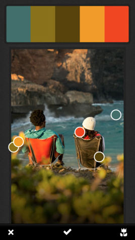
Kuler, a free app for the iPhone by Adobe, helps you select a great color palette almost effortlessly. The app works by using the camera on your iPhone. Simply point the camera at your favorite piece of art or a set of objects that you like, and the app automatically generates a simple color scheme based on that picture for you. It’s actually quite impressive.
Best of all, you can save your themes and use them as a reference when you’re out selecting wall paper, paint, bedding, window treatments, or decorative objects for your bedroom. The application is equally useful for graphic designers who need to come up with color palettes for websites and print work.
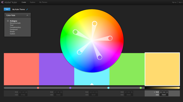
For more info, or to use the desktop version of the app, head over to the Kuler website. You can also explore color themes that other users have created.

